Packaging Design
Album Art
Designers lend their talents to a wide variety of clients every day, oftentimes creating consumer perceptions for everyday products and items. Put quite simply, if your product does not stand out on the shelf, what will make someone pick it up to look closer? Consumers once given the opportunity to reflect will realize that design and aesthetic of a product has more influence on their purchase than they might expect. The Designer’s Republic decided to play with this concept in the creation of both the packaging and promotional material for the Aphex Twins album, Syrio.
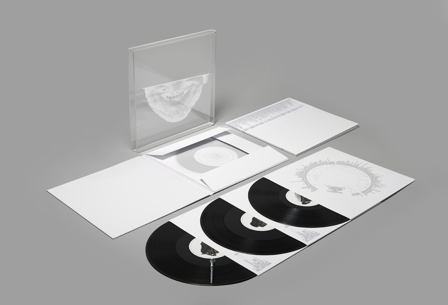
Syrio approaches the album design in a much more minimalistic way than almost any other album has. The white packaging with simple black type is incredibly straight forward and devoid of the frills of imagery or illustration that accompanies most album art. That is not to say that TDR didn’t include layout flourishes here and there, the inside cover for instance features text running circularly around the center as if to mimic the size of a vinyl, however the style is meant to be fairly bare bones. Even the very front cover only shows the lower half of a face, and as this part of the packaging is opaque, there is a suggestion that the face is not truly the focus of the design. What sets the album design out from almost any other is the extensive construction that went into creating the complete packaging. The outside jacket holds a fold out vinyl compartment that unfolds to show an inner jacket that houses the three records within. Included in this packaging is the project budget showing the costs of each part of TDR’s campaign.
The simplicity of the work forces the audience to digest it in an abstract learning process, bringing out the larger questions of tone and current societal expectations. In a world where the ‘picture on the box’ is more appreciated than the craftsmanship of the physical item, our modern culture conforms to the digital standard that looks often trump physical features. This messages says volumes about what the Aphex Twins hope the audience will consider. The fact alone that they decided to produce a physical vinyl version begs customers to return to ‘craft’ with them, as they surely do within the content of their music. A simple exterior will shift focus to the importance of the interior content.
TDR’s approach to the design can be considered illustrative in a counter intuitive way because it highlights a culture that is obsessed with pretty packaging and shiny things, often leaving actual content quality to the wayside. The simplistic imagery is inspired to contradict the usual flash and appeal of an album, while still delivering a sharp and crafted product. This is much like the recent release of Kanye West’s 2013 album Yeezus, which famously did not even have a CD insert but rather just a red label on a clear CD case with the album title on it. Conversely Yeezus found critical acclaim for being one of West’s most successful records. Simplicity on the outside can often mean the true craftsmanship was focuses on what really matters: the product.